Direct Access designed, manufactured, and delivered two innovative Tactile Maps at Chelsea Football Club’s Stamford Bridge, enhancing wayfinding for disabled fans, away supporters, and visitors navigating the stadium environment.
Strategically positioned at the Britannia and Stamford Gates, the maps provide an accessible starting point for visitors beginning their journey through the stadium, enabling fans with disabilities to independently understand and navigate the wider site.
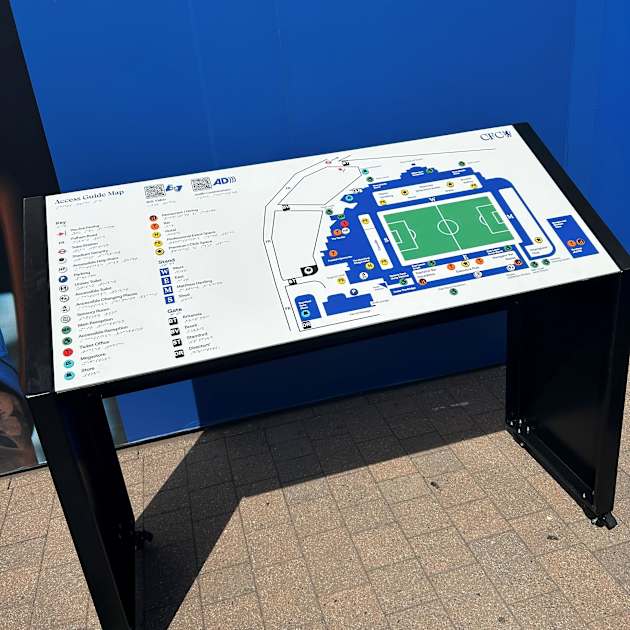
Like many stadium environments, Stamford Bridge presented a common wayfinding challenge: there is no single obvious destination or endpoint for visitors. To address this, our design team moved away from traditional “heads-up” mapping and instead positioned the pitch as the central reference point. This orientation allows visitors to understand the stadium layout intuitively, enabling them to navigate the site using a consistent clockwise orientation from the map locations.
Challenging the assumption that vision is the primary sense used for wayfinding, our team also developed a multi-sensory approach designed to support visitors with a wide range of access requirements.
Alongside the visual information displayed on the map faces, key icons are raised to provide tactile identification, with braille translations of accompanying text embedded beneath each element. This allows visitors to explore key information through touch as well as sight.
The integrated QR codes provide access to audio-described content covering key accessibility provisions across the stadium, including the location of sensory items, directions to the sensory/quiet area, and information on booking the stadium’s British Sign Language (BSL) tours.
Additional audio content provides guidance on identifying on-site staff members, collecting RADAR keys for accessible toilets, and locating Changing Places facilities.
As with all Direct Access Tactile Wayfinding Maps, the design was developed in close collaboration with the client’s Disability Access Officer at Chelsea Football Club. This ensured that key points of interest, accessibility facilities, and routes to public transport connections were accurately represented and reflected the needs of visitors.
The design approach followed the principles outlined in the Sign Design Guide, while also benefiting from the expertise of our own team members with lived experience of visual impairments.
Combining accessibility principles with Chelsea’s established brand identity, the maps incorporate the Club’s iconic blue colour palette while maintaining the contrast levels required for clear legibility by people with visual impairments.