When we hear the phrase “wayfinding”, what most frequently comes to mind is the application and availability of signage in a particular environment, which is normally used to signify elements of a space that require visitor attention, or offer directional guidance in complex environments, such as shopping centers, hospitals, museums, theatres, apartment buildings, public parks, etc.
However, this is only half the story. In actuality, the purpose of “wayfinding” covers much more than these factors since it pertains to our ability to comprehend and perceive the environment around us. In many ways, effective wayfinding is less about signage provision specifically but is better to be thought of as a tool that helps guide people to orient themselves, and positively influence their cognitive decision-making.
Since navigation through a space is a multi-sensory “problem-solving” task that requires the use of four out of our five senses (smell is not often utilized but remains a way many people associate themselves with a particular place), it goes without saying that one wayfinding approach will not be suitable for everybody.
A blind or near-sighted person, for instance, will find it impossible to navigate a space without auditory guidance such as spoken announcements, the assistance of on-site staff, or tactile wayfinding aids such as braille maps.
Conversely, a deaf person will not find these methods useful and instead require clear and effective signage that communicates key information, and optimum lighting levels at all times of the day, in all areas, but especially at information desks, onto faces, to enable them to lip-read.
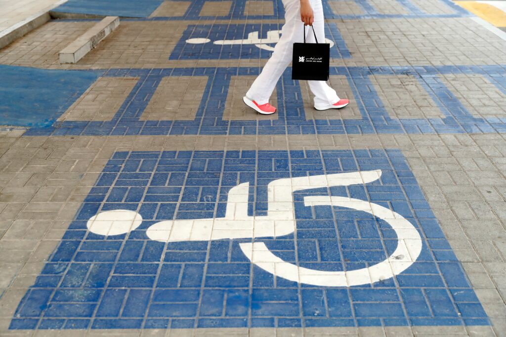
All in all, the diversity of forms that wayfinding can take is endless, and in the interest of true inclusion and the facilitation of a disabled person’s independence, sites that are open to the public must consider a wide variety of capabilities when figuring out how to facilitate movement through the space. Another group we have yet to touch on is people with cognitive impairments, who often struggle with complex language. Therefore, we typically advise signs to make use of representative icons and symbols, with text that is simple and to the point.
So, with all this in mind, what is considered best practice when it comes to wayfinding? What can you do to make everyday navigation at your premises as accessible as it can be? Broadly, wayfinding should remove physical barriers to access for all People of Determination. Signs and wayfinding should be easily interpreted by all, lighting must be good at all points of interest, and areas where navigation will be required such as information desks, corridors, external pathways, fire exits, etc.
Some key considerations to make (which apply specifically to site signage) are;
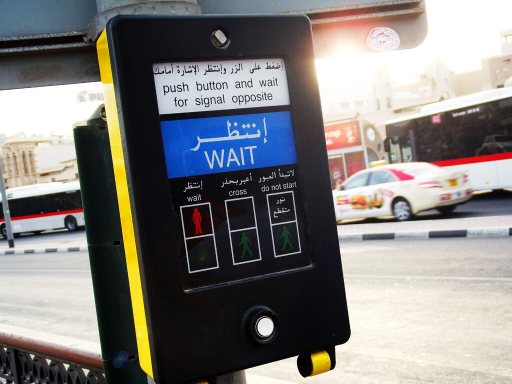
Providing color contrast is especially important for the legibility, visibility, and noticeability of any form of written information as without a good combination, a person with visual impairments is likely to misinterpret or be completely unable to perceive said information. For signs, a contrast must be provided between the object (in most cases, a wall) it is attached to and the background of the sign, which must in turn contrast with the written text and images. Text and images on paper must also contrast with their background. Black and white provide the highest contrast, while other dark colors with white can provide very good contrast. Yellow and black is another good combination used in hospitals. If you are unsure whether the color combination of your sign meets the legal requirements, WebAIM provides a free online color contrast accessibility checker. Alternatively, an access auditor can determine the contrast of your signage, leaflets, or website for you.
Wayfinding information should be detailed enough to provide a good overview of a site but be designed in such a way that a person can easily locate a point of interest and quickly decide on a direction to get to said point of interest (even if it’s at a considerable distance away). This applies to everything from the location of WCs and Changing Place facilities to on-site cafes, car parks, and lifts. The information provided should under no circumstances be inaccurate and align with any online information, particularly as people with mobility impairments and cognitive impairments rely on pre-visit information to plan their route and require strict planning ahead of time to suit their access requirements (such as wheelchair-friendly routes and/or areas with low traffic).
In terms of the content itself, it must use language which could reasonably be considered simple. If it references a point of interest specifically catered to People of Determination, such as an accessible entrance, parking area, lift, accessible WC facility, etc. it must not use outdated or offensive terminology (People of Determination, not “handicapped”, “the disabled” etc.)
Staff disability training is another key part of wayfinding to prepare for as there will, without doubt, be instances where members of staff are asked for assistance by members of the public. Navigation can often be stressful and worrying, especially in unfamiliar environments, and this could not be truer to the experience of many if not most disabled people visiting places, they are unfamiliar with. Therefore, all staff should undergo disability awareness training with NRAC-accredited professionals (like Direct Access) to ensure that staff can react when someone with a disability requires assistance.
One of the most frequent reasons for interaction between a staff member and a visitor involves verbal wayfinding (or providing directions). This is because most people regardless of disability would much rather speak to a person than refer to a map. For this reason, the information provided must be reliable, succinct, easy to remember, and delivered by the staff member with clarity in a friendly tone to ensure the visitor can digest the information. When speaking to a deaf person, for instance, it’s vital to pronounce sentences clearly and face them directly to ensure they can lip-read. Moreover, staff should be patient and understand if directions are difficult to understand for any reason, whether for being too complex or if the person asking has a cognitive disability or poor memory.
Another factor that must be considered in wayfinding is providing up-to-date and detailed information about local transport routes which is a necessity for People of Determination who do not drive a car. This is the case because many people cannot drive due to disability or prefer to take public transport. Therefore, to make People of Determination feel welcome, it is vital that site owners clearly mark taxi ranks and drop-off points in site signage, maps, and online, as well as provide information about local bus routes and detailed information on how to get there, suggesting routes using clear and simple but detailed instructions.
The potential consequences of poor wayfinding, aside from people getting lost, is a negative impact on mental well-being because of the powerlessness some might feel in such a scenario, in addition to stress, frustration, and annoyance, which will likely impact on-site staff and disrupt their daily routine. Therefore, it is in the best interest of all parties that building managers regularly review the on-site wayfinding strategy for potential issues. This can be achieved by bringing an “Accessibility Champion” on board to specifically monitor this issue ( a member of staff who handles accessibility-related inquiries and ensures compliance with the law). Alternatively, a site manager can hire an accessibility consultancy like Direct Access to review and make recommendations in line with up-to-date best practice guidance on an annual basis.
Direct Access can also provide your site with bespoke tactile braille map boards that utilize audio-described and Sign Language content via QR codes to allow users access to digital, portable wayfinding information on their mobile phone devices. Click the button below to learn more!